How to Set the First List Item as Active and Activate Others on Hover in CSS/JavaScript
Hello, fellow designers! Let’s delve into the realm of Set the first list item as active and activating others on hover in CSS/JavaScript.
If you’re working with an unordered list (ul) and want the first item to be active by default while other items become active on hover, this guide will walk you through the process using CSS and a bit of JavaScript.
Step 1: Basic HTML Structure
First, you’ll need a simple HTML structure for your list:
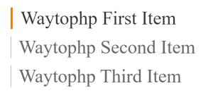
<ul>
  <li>Waytophp First Item</li>
  <li>Waytophp Second Item</li>
  <li>Waytophp Third Item</li>
</ul>
Here, we have an unordered list with three list items.
Step 2: CSS for initial styling
We’ll start by adding some basic CSS to highlight the active item and apply a hover effect.
ul {
    padding: 60px 0 0 60px;
}
ul li {
    list-style-type: none;
}
ul li {
    font-size: 20px;
    color: #666;
    border-left: 1px solid #666;
    padding-left: 20px;
    transition: 0.6s ease all;
    -webkit-transition: 0.6s ease all;
    margin-bottom: 20px
}
ul li:hover {
    color: #333;
    border-left: 6px solid #FF7200;
}
This CSS makes each list item have a left border orange color when hovered.
Step 3: Adding Hover Effect with JavaScript
If you want more control, such as toggling the active state between items, JavaScript will help:
<script>
    $(function() {
        $('ul li:first-child').addClass('active');
     	$("ul li").mouseenter(function(){
       		$(this).siblings().removeClass('active');
      	});
     	$("ul li").mouseout(function(){
        	$('ul li:first-child').addClass('active');
     	});
    });
</script>
This JavaScript snippet adds the active class when hovering over a list item and removes it from the previously active item. In your CSS, style the active class:
ul li.active {
    color: #333;
    border-left: 6px solid #FF7200;
}
You can quickly set the first list item to be active and apply hover effects to the remaining items by combining CSS with a little bit of JavaScript. This method improves the user experience by providing an interactive visual hint.
Refrence Image: